New logo and image
We are pleased to introduce our new logo and image. After more than 10 years with our previous logo, we felt it was time to refresh with a more modern image. (lien vers la version française ici).

A Description of the New Logo and Image Key Elements
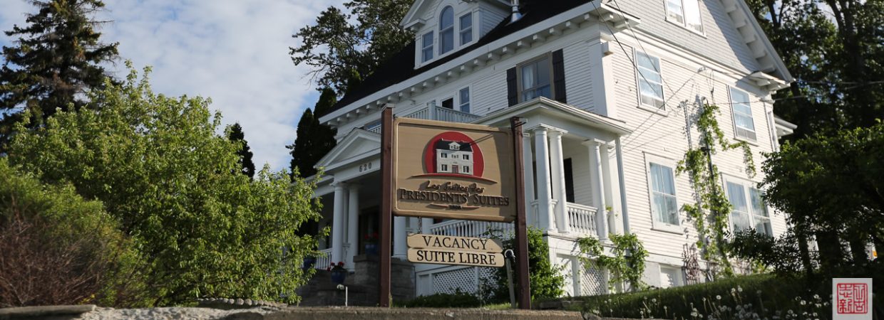
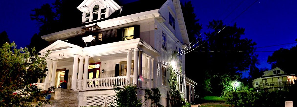
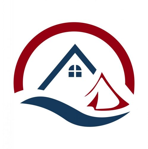
Since our two main products are vacation rentals and glamping, both these products are central elements of our new logo with the roofline of our historical vacation rental homes and the glamping tent.
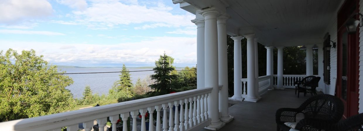
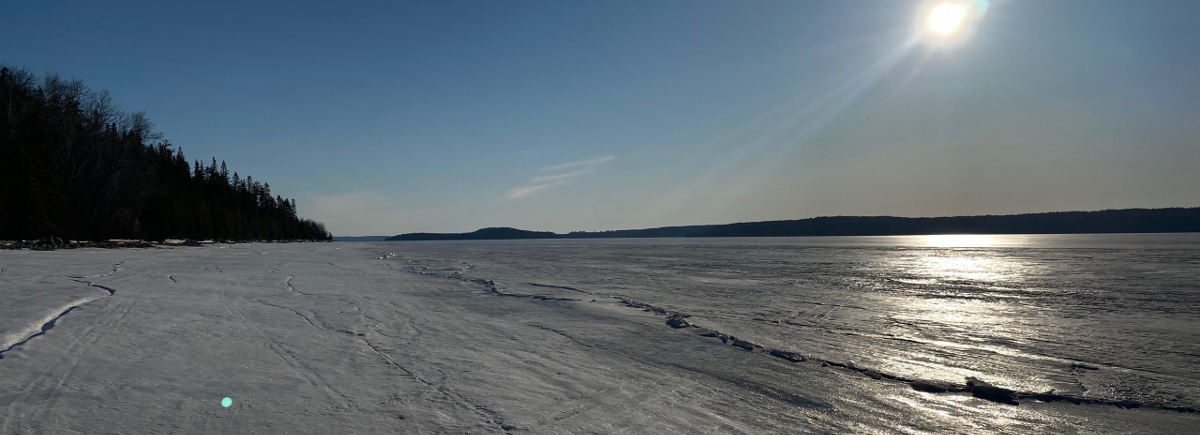
We also wanted to add the wave, representative of our beautiful lake Temiskaming. The circular background is the link to our previous logo and represents our Northern Ontario sunrises and sunsets.
The fonts and colours are more modern and are lying somewhere between the artistic and business worlds.
We want to thank Emily Creative + Co. for helping us with this design.
The Importance of the Logo and Image
Other than the brand name, a company logo is one of the most important things people will notice or continue to see and notice every time they encounter the brand in the future. It was critical that our logo told the right story about us and the Presidents’ Suites. We wanted it to convey our personality and have it be immediately recognizable as unique to our company.
 Our previous logo was getting old and was now too complex.
Even though we have loved our previous logo, over time it had grown stale and was no longer as appealing as it was before. There were a few design elements that were no longer in style that ended up making the logo look outdated. Logos with a lot of detail or too much gradient often don’t translate well to digital. Modern designs are all about simplicity, and fortunately logos without too much complexity usually look best on the web.
The company is evolving
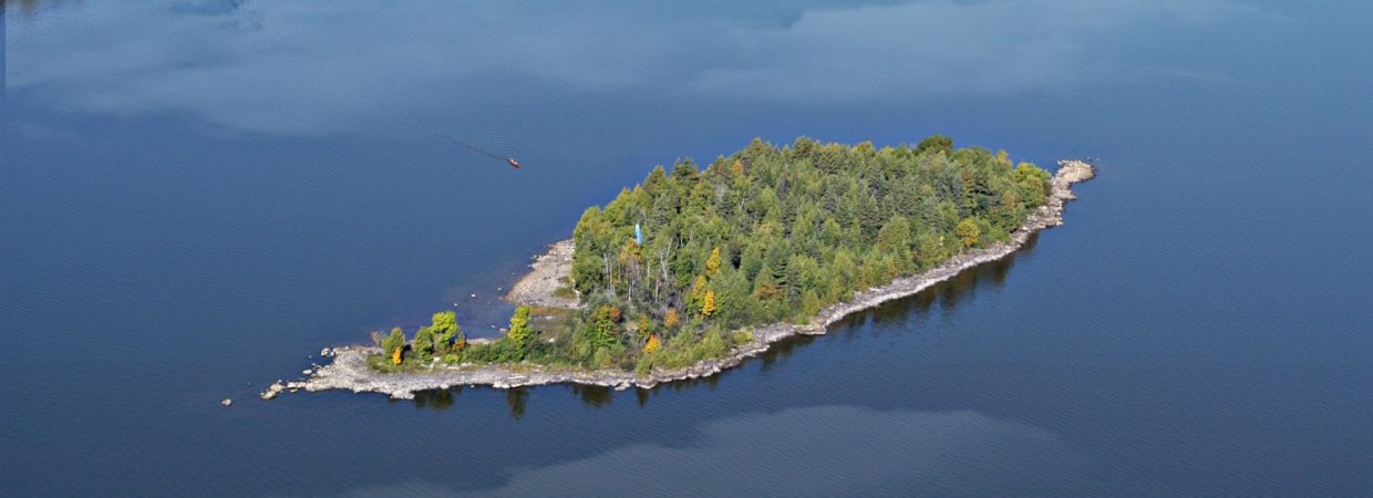
When the Presidents’ Suites first got started and the original logo was designed, it was probably perfectly emblematic of what we stood for. But as we all know, we do not have a tendency to remain static for long and we evolved over time. A major new product was recently added, glamping on Farr Island. A logo redesign was required to help signal this added important new direction.


